As we mentioned in our previous article, we are currently working on a major Tahometer overhaul that will serve to bring you a faster, safer and all-around drop-dead gorgeous user experience. In the meantime, however, it is time for yet another round-up of some of our project’s latest developments!
Transparent development process
For starters, you may have noticed a slight change of tone and pace in our blog posts. This is simply emblematic of our project’s new general direction, as we plan to soon get started with a wholly transparent development process, in close cooperation with our valuable users.
The first phase of this process should officially begin when Tahometer is relaunched at the end of 2018. From then on out, we plan to share some exciting new development plans, implement continuous deployment — which most notably will allow users to get web updates every week — in addition to introducing an all-new voting system that will enable you to opine on the inclusion of new features!
New Time Tracking Process
In order to improve accuracy, we have also made significant changes to our previous time tracking algorithm. So now, for example, if you start Tahometer for just 3 seconds, as expected, only 3 seconds will be counted — as opposed to in the older version of the agent, where a full minute would have been tracked! 😳
Better Time Zone Settings
When reviewing user activity, administrators will soon be shown timestamps as if they lived in their user’s location. So if, say, your employee in Hong Kong clocked in at 9am on the 23rd of June, this is the time and date that you would also see in New York, despite your local time difference. Nifty, right?
Say Hello to a Brand New Design
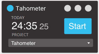
As promised, we are also implementing a much more modern and sleek user interface. From the screenshot below, you can probably already tell that in addition to displaying information far more effectively than before, Tahometer now fits in beautifully with your operating system, as it fully embraces ubiquitous flat design.
So make sure you are ready, because this polished black, blue and gray incarnation is sure to delight even the frostiest of eyes!

Other Changes
Finally, we have completely done away with screenshot descriptions, comments and other minor settings. This, however, should in no way influence your overall experience, as these features were found to be very rarely used by all of our users, across the board.
Thoughts?
So that’s it for now, but are you getting as pumped as we are for the next release!? You know what to do in the comment section below! Please don’t hesitate to contact us at any time, as our team are always happy to address all your concerns :).
-Tahometer out!
Post A Reply