As you’ve already been made aware, we’ve recently started redesigning our Statistics page with the aim of turning it into an all-new dashboard packed with new functions, including data visualization and advanced reporting.
The project roadmap we shared with you kicked off a series of posts that gave you an exclusive look behind the scenes of our development process. Today, our goal is to do something similar, as this post will hopefully serve to to pierce through the veil and shed light on some of the things we have in store for you in the very near future. So let’s get going! 🙂
Numbers are dead. Long live graphs!
Science has already proven that our brains are able to process visual data a lot faster than text. Reportedly, as much as 70 percent of all our sensory receptors are in the eyes, and we are capable of making sense of a visual scene in less than 1/10 of a second.
Taking this into account, we have come to the conclusion that the current look of our Statistics page does not enable perceiving vast amounts of information in a fast and digestible way. This is why we’ve decided to repackage our statistics in the form of interactive graphs, as it is simply the easiest and most powerful way to organize information visually. We hope this new feature will help you to absorb information in more clear and productive ways.
Key Features and How You Benefit from Them
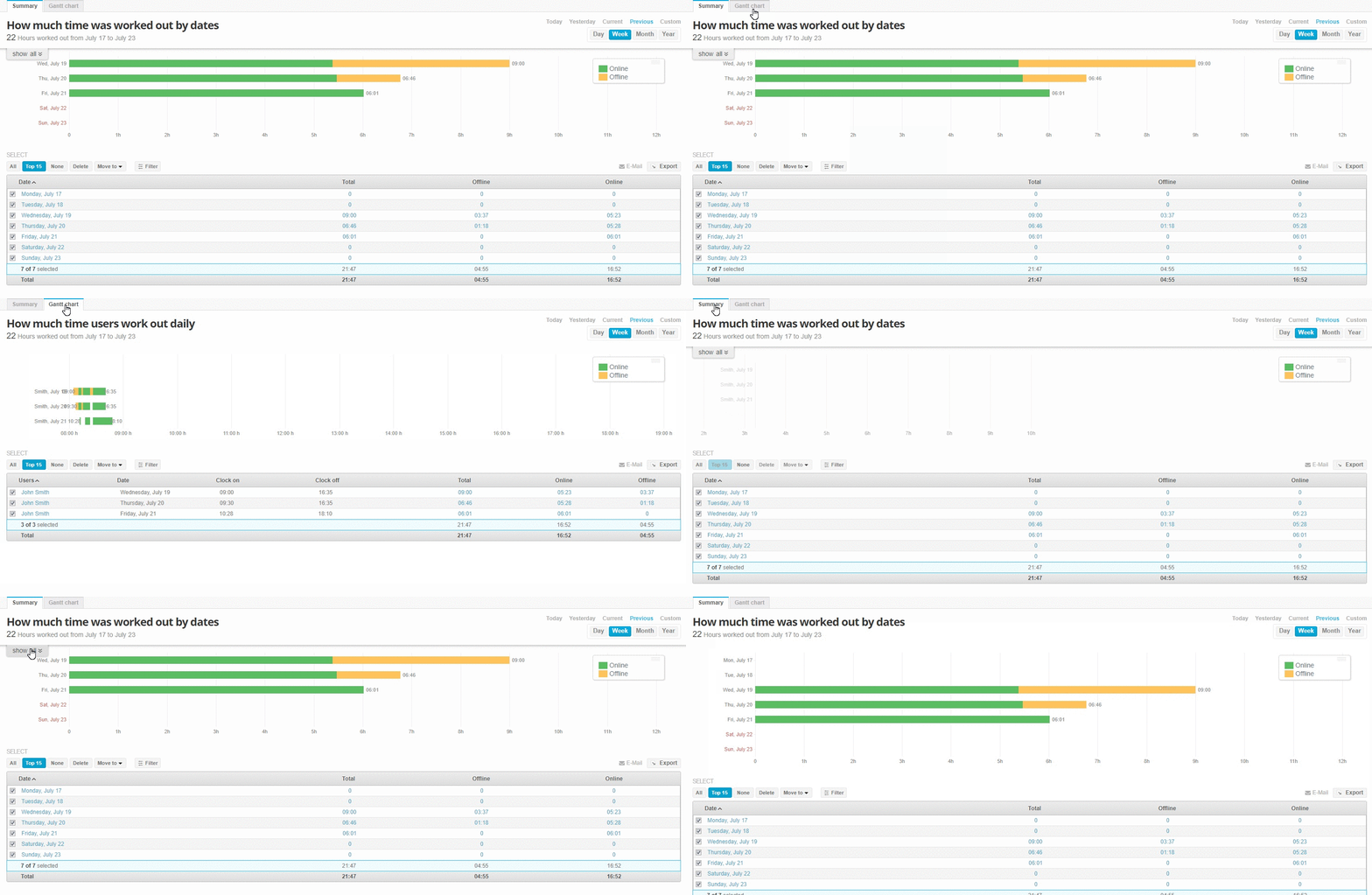
Summary tab:
- Graph showing online time (green bar),offline time (yellow bar) and total time worked by your company as a whole
- Tooltip displaying the top five users (ranked by total tracked time)
- Spreadsheet showing all users and their tracked totals
- Advanced filters that allow you to specify the data you would like to see
- Export button for downloading reports
Click on one of the bars to be sent to the Timeline tab, where you’ll be met with time reports for every user on any given day.
Timeline tab:
- Graph displaying detailed online and offline times. Gaps between bars indicate the absence of tracked activity for this period
- Clicking on the bar will display a user’s screenshots for a chosen day. In addition, you can see all your company’s screenshots on the Screenshot page
- Great filters that allow you to display all possible statistic reports
- More benefits for you:
- Simple visual data
- Multi-mode data display
- Highly filtered information for more relevant and desired results
- Easy one-click reporting
- Detailed statistics in numbers, organized in a convenient timesheet
- Discover the most hardworking person in your domain with a single glance 🙂
What comes next?
At the moment, our team of immensely creative and never-sleeping developers are working on Tahometer’s Screenshot and Offline Time pages. We are also preparing a new, intuitively simple navigation system within your dashboard, which we will discuss in a future post.
- That’s it for today! We’re always glad to hear your ideas and answer your questions, so take advantage of the comment section below.
1 Comment
You can post comments in this post.
This post has given me some actionable tips. I expect I’m going to have to re-read over and over to let sink in.
online timesheet 8 years ago
Post A Reply